Figmas file management sucks
Let’s be honest, if you’ve used Figma, you know the pain of its file management system. When a product is as polished and delightful as Figma, clunky features like file organisation stick out like a sore thumb.
Recently, as part of an interview process, I was tasked with redesigning Figma’s file management system. It was a chance to tackle those frustrations head-on and reimagine a better way of doing things. I was so pleased with the concepts I developed that I decided to turn the work into a full case study.
Figma, if you’re reading this, please, do us all a favour and fix it. Seriously.
Product Design
Here for pretty UI only?
Below, I’ve outlined the detailed process that led to my design concepts.
I know this level of detail won’t be for everyone, so if you’re just here for the pretty UI, feel free to skip ahead ✨
Jump to design concepts →The User
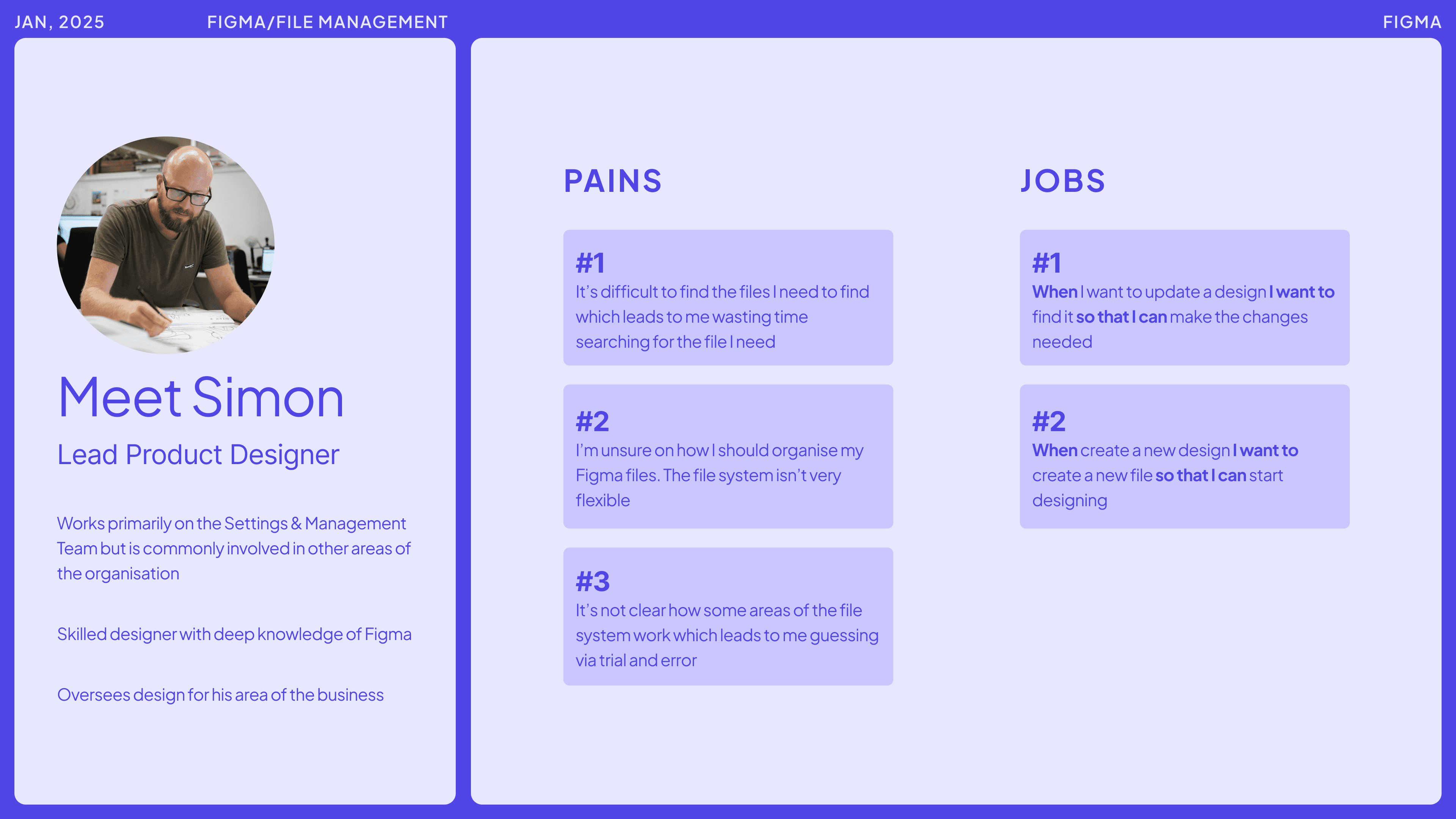
Understanding who we're solving for
Designers in both small and large organisations face friction with Figma’s file management system. However, I hypothesise that this issue only intensifies as organisations scale. For this work, I chose to focus primarily on designers working within larger organisations.
Goals & metrics
Why bother?
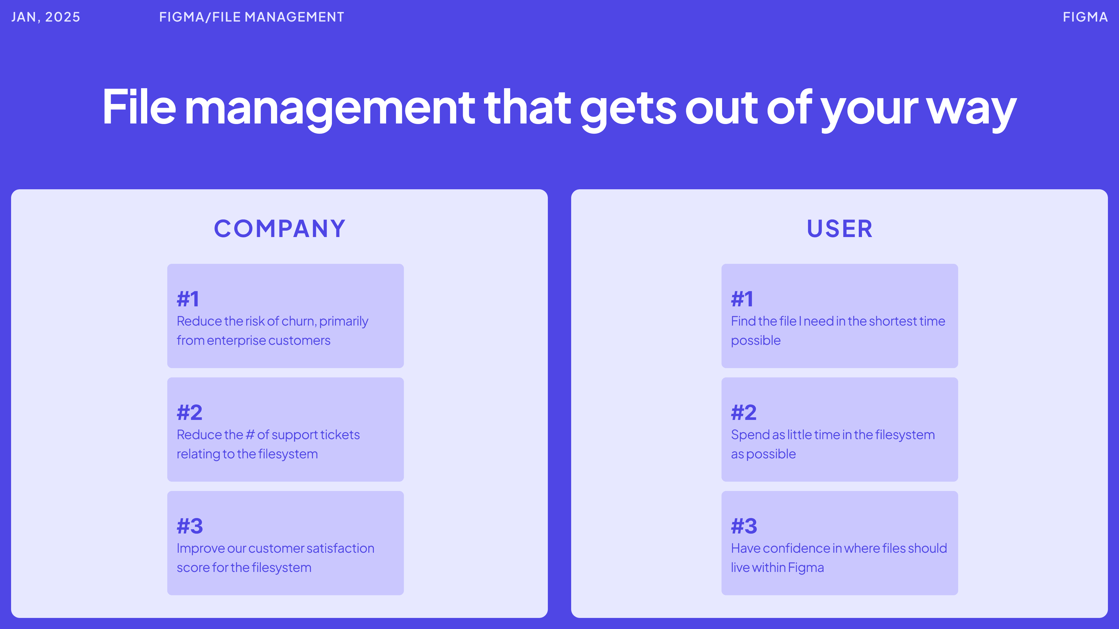
Poor file management might not be a leading cause of churn right now, but in the future, competitors who innovate in this space could start encroaching on Figma’s core business. For Figma, this is about deepening the competitive moat.
The vision
File management that gets out of your way, file management is a necessary evil on Figma. Designers want to spend the majority of their time doing what they’re great at: designing. Not wasting time digging around the file system.
What does great look like?
Best in class
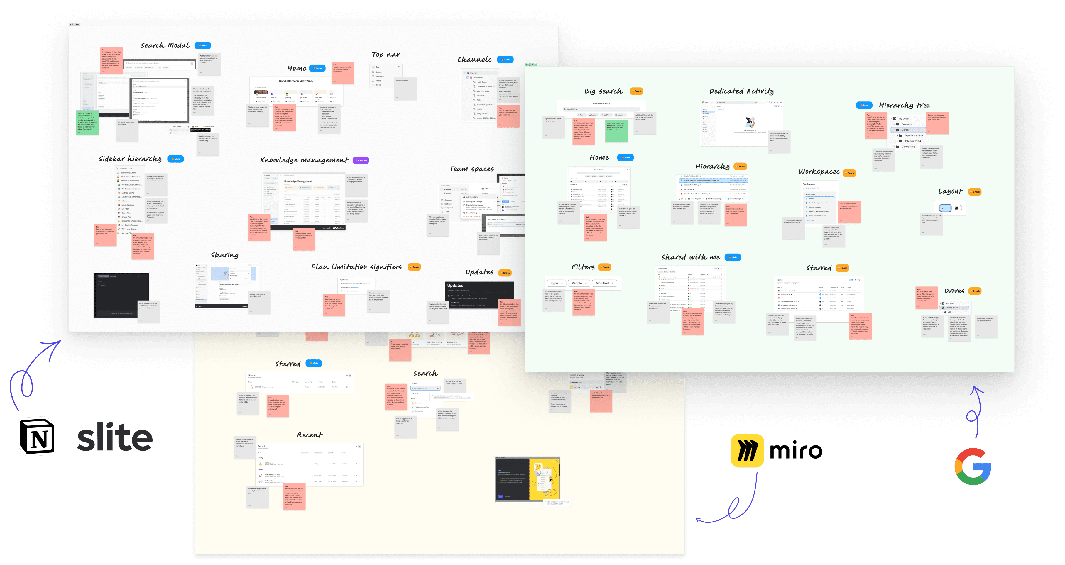
I looked at 4 other products. I wanted to see how the best-in-class products approach the challenge of file management and see what we can learn from them
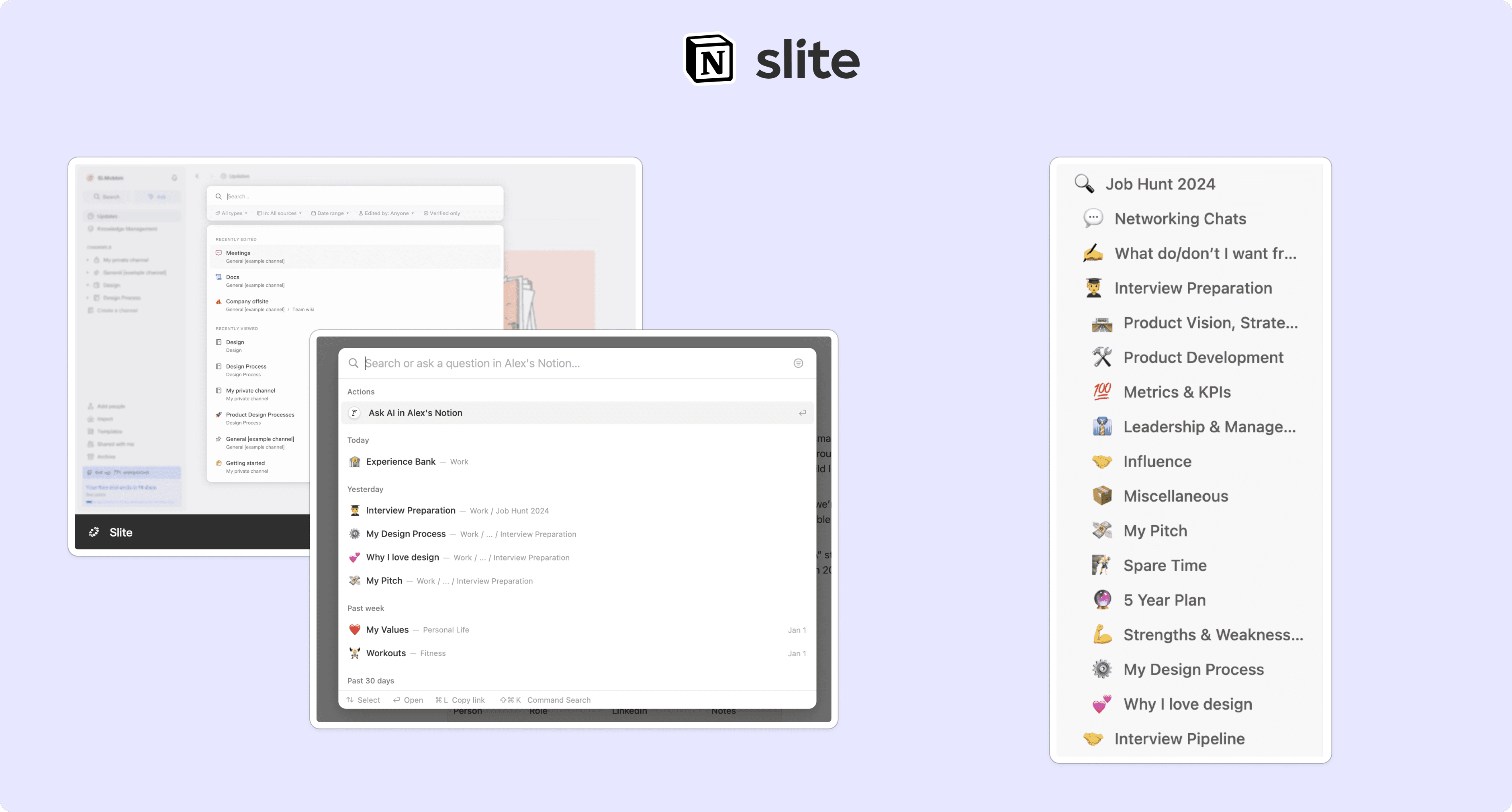
Notion & Slite
Notion and Slite excel in file management with flexible hierarchy trees that mirror organisational structures, making files easier to locate. Both also feature spotlight search, accessible from anywhere in the app, reducing clicks and speeding up file discovery. Additionally, they effectively highlight recently edited files, keeping important work within easy reach.
Google Drive
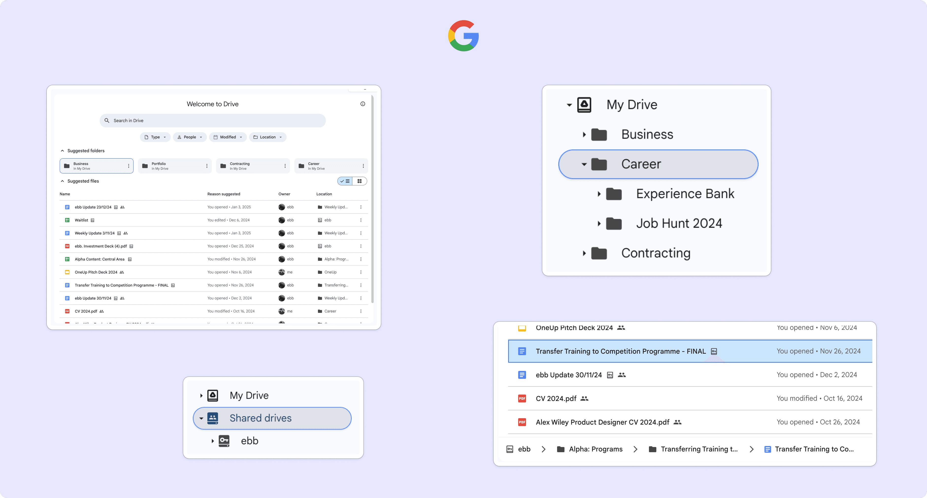
Google’s file system prioritises collaboration, with a dedicated ‘Shared with me’ tab and clear indicators of file locations within the hierarchy. The traditional folder model feels familiar, mirroring the OS file system, while all drives and file exploration are accessible via the sidebar. However, the system can feel rigid, navigating through folders and loading new screens takes longer compared to the seamless sidebar navigation of tools like Notion and Slite.
Miro
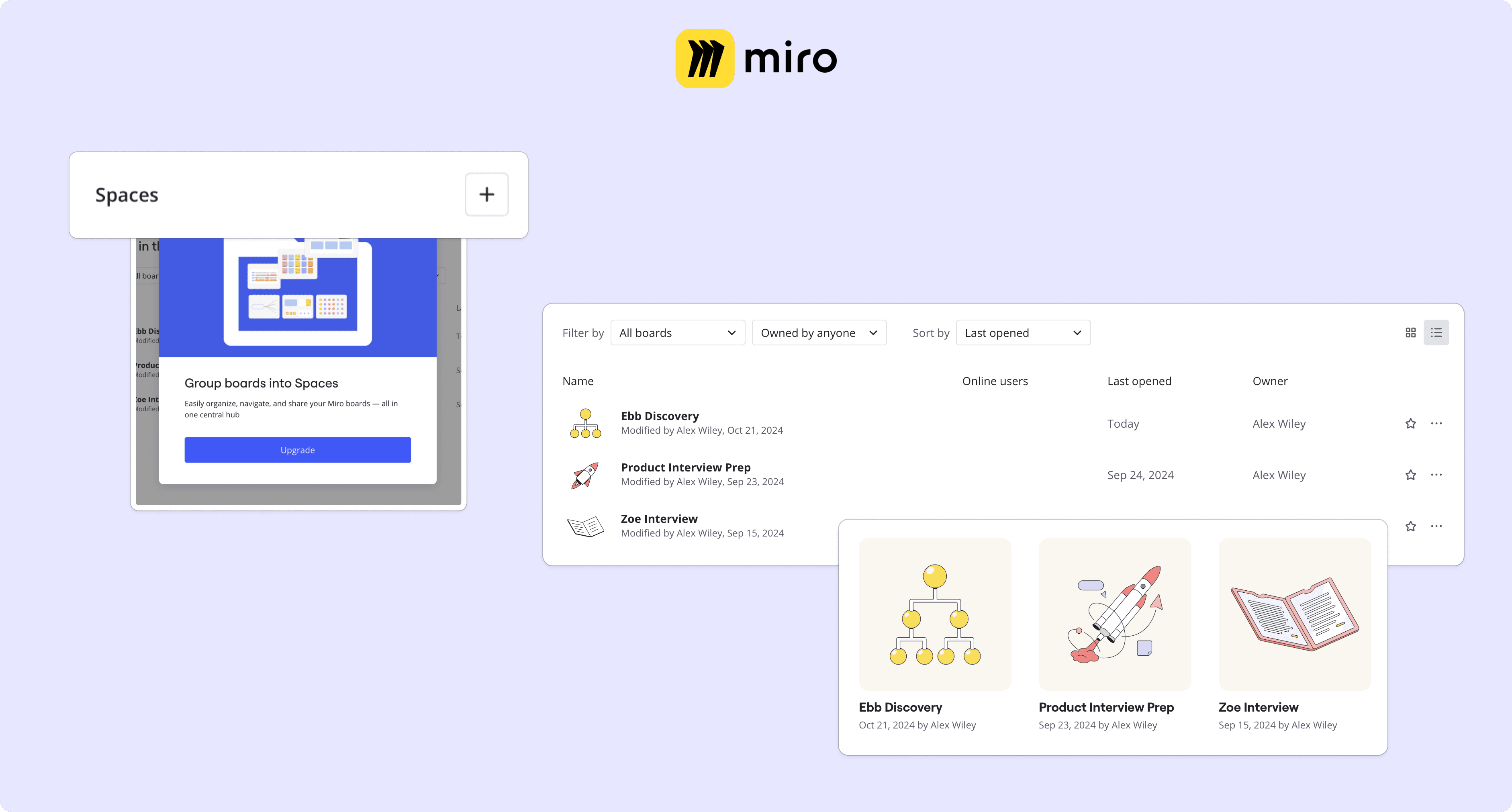
As an indirect competitor to Figma, Miro’s approach to file management feels basic overall. However, they offer some noteworthy features, such as ‘Spaces,’ a premium feature that is clearly signposted in the UI, something Figma currently lacks. Additionally, their thumbnail solution is well-executed, though there’s potential to improve upon it further.
Current state
The existing filesystem
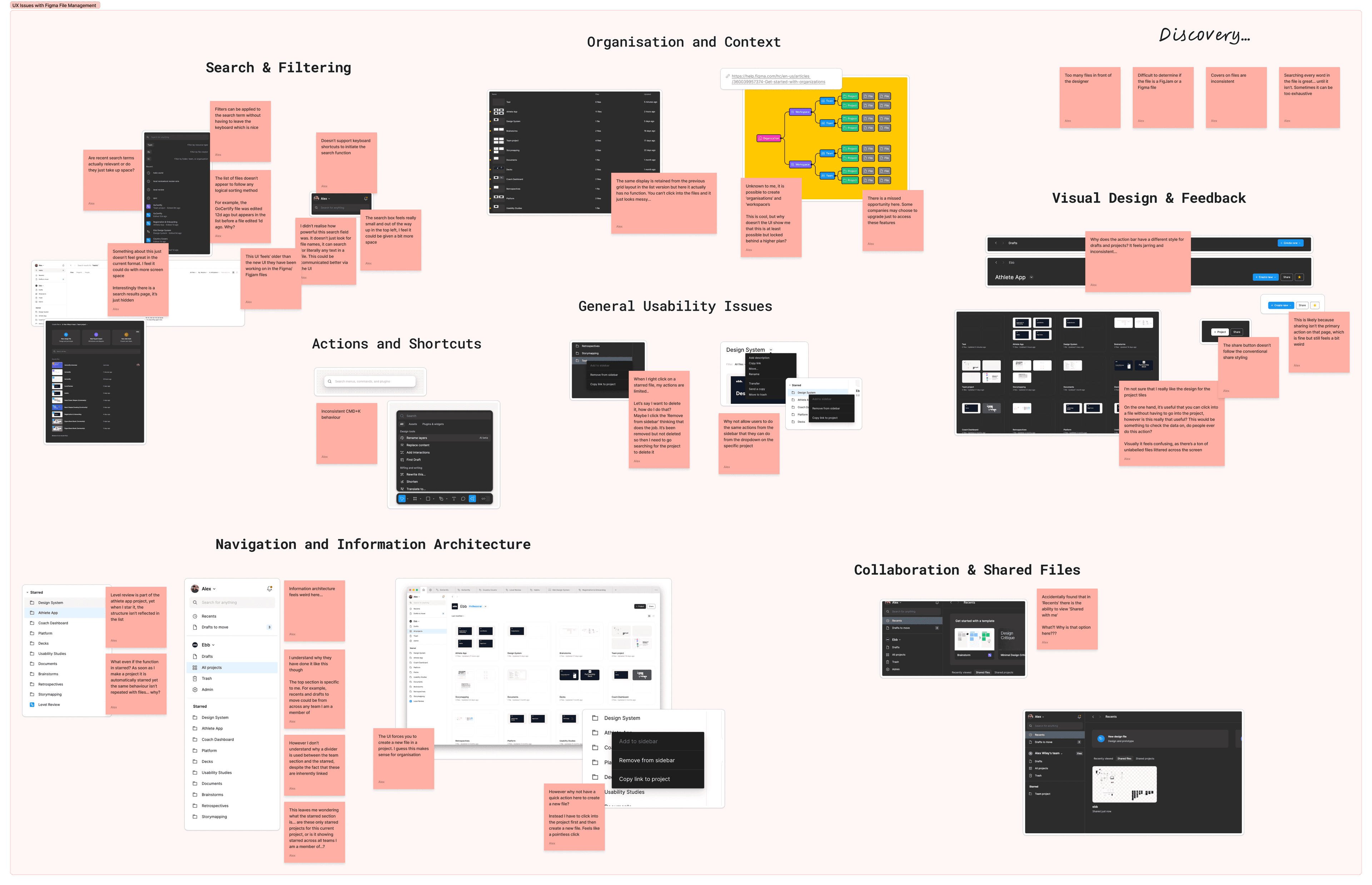
I analysed Figma’s current file system and found the UI feels outdated compared to the modern interface patterns used across Figma, FigJam, and Slides.
Search & filter
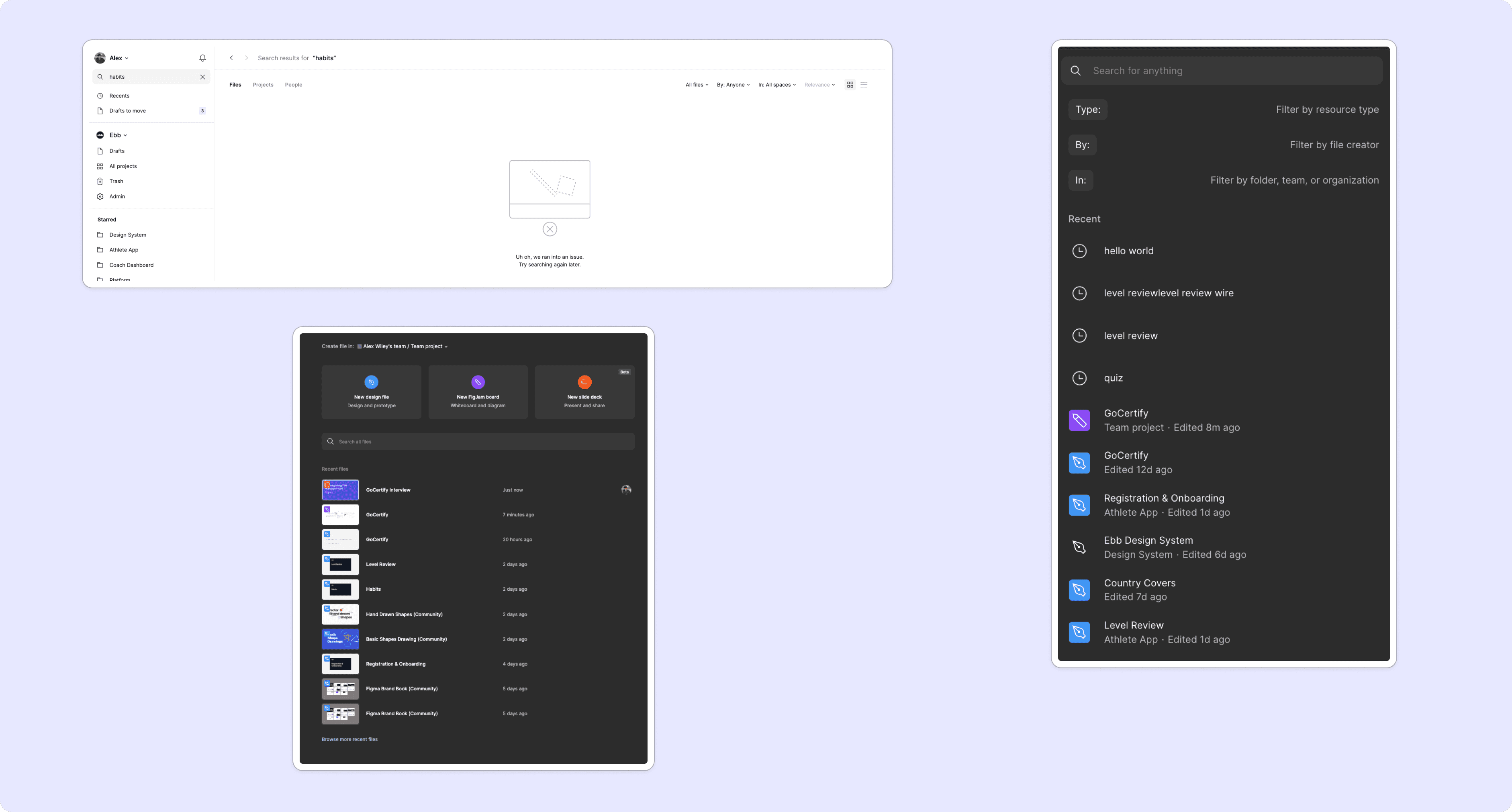
Figma’s search feels disjointed:
- Files appear unsorted, making them feel random.
- Recent search terms take up space but add little value.
- Text filters are helpful but fiddly to use.
- No keyboard shortcut exists for the main search, though CMD + T offers a limited alternative.
- The search lacks filtering, metadata, and folder support, limiting its usefulness.
All projects
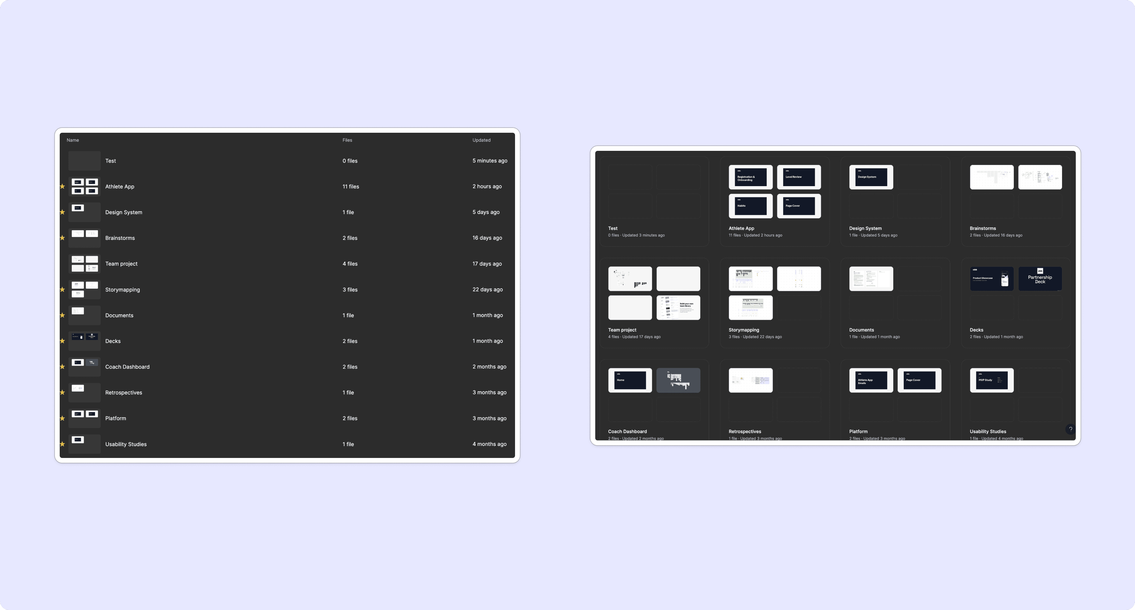
The ‘All Projects’ view feels messy, inconsistent, and overwhelming, especially with a large number of projects:
- Projects with fewer than 4 files leave empty spaces in the cards, creating visual clutter.
- It doesn’t show useful details like who last edited the project or the types of files it contains.
- Thumbnails lack polish and can be painful to look at. Miro handles this better with illustrated placeholders.
- In list view, thumbnails are too small, and it lacks the quick file access available in grid view.
Home sidebar
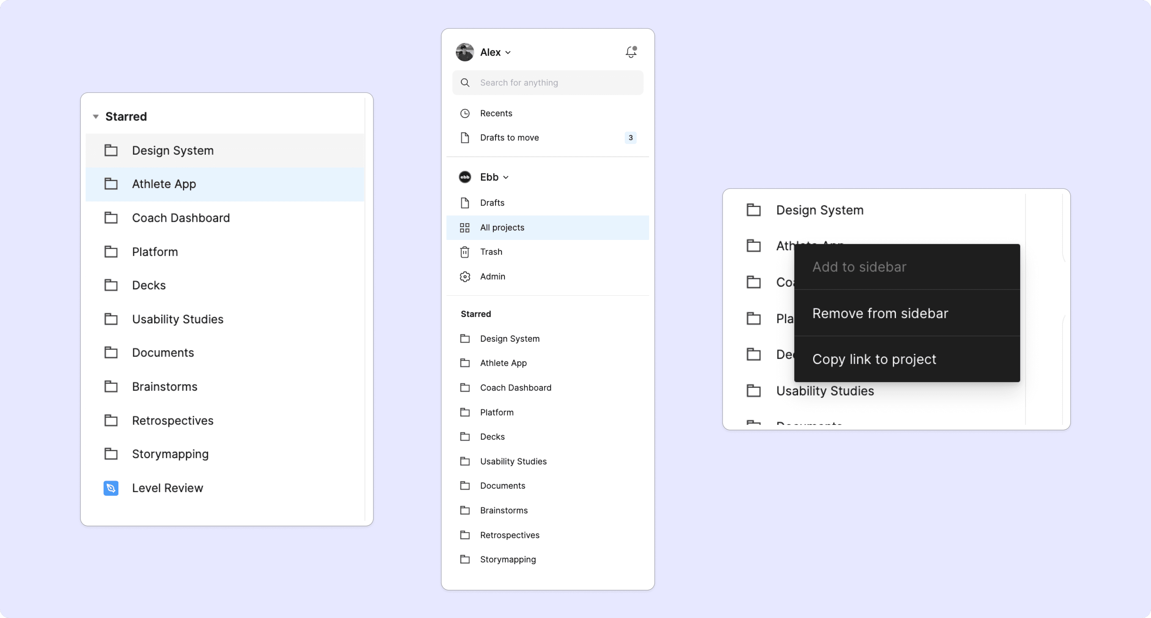
The sidebar in Figma feels unintuitive and inconsistent:
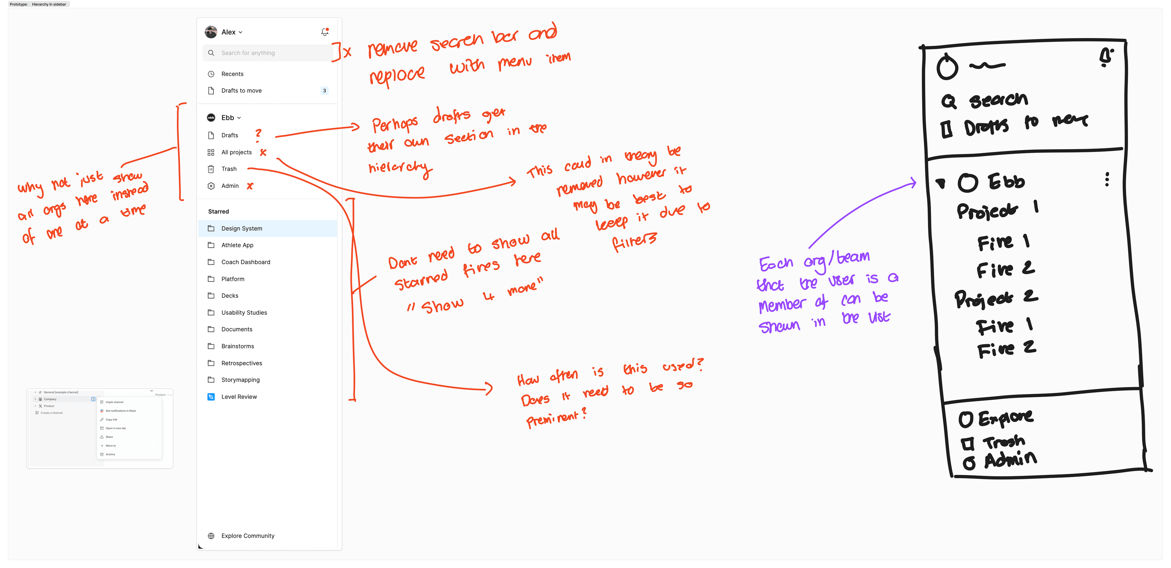
- The relationship between starred files and folders isn’t reflected properly. For example, a file like Level Review belongs in the Athlete App folder but isn’t shown this way.
- The information architecture feels off, with a divider splitting sections that are inherently linked.
- Items like Trash and Admin, which are rarely accessed, are prioritised above files.
- It’s strange that I can search across multiple organisations and teams but can’t see all those files in the sidebar.
- Sidebar actions are limited. For instance, I can’t delete a project directly from the sidebar and must open it first.
Shared with me
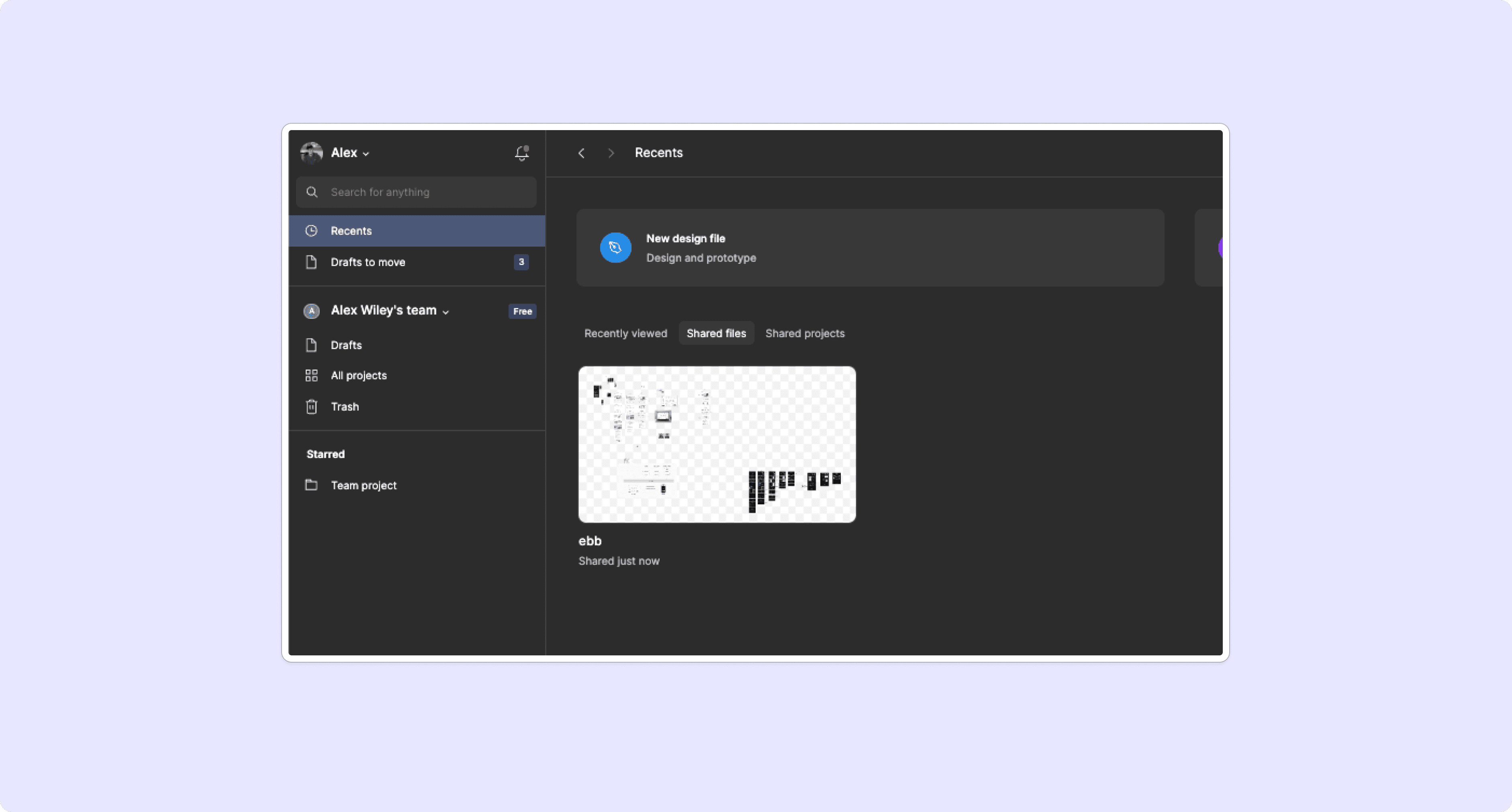
During my research, I stumbled upon a hidden gem, the ‘Shared files’ view!
It’s buried under the Recents tab, making it hard to find.
For a product that prides itself on collaboration, it’s surprisingly difficult to access files that have been recently shared with you.
Understanding user journeys
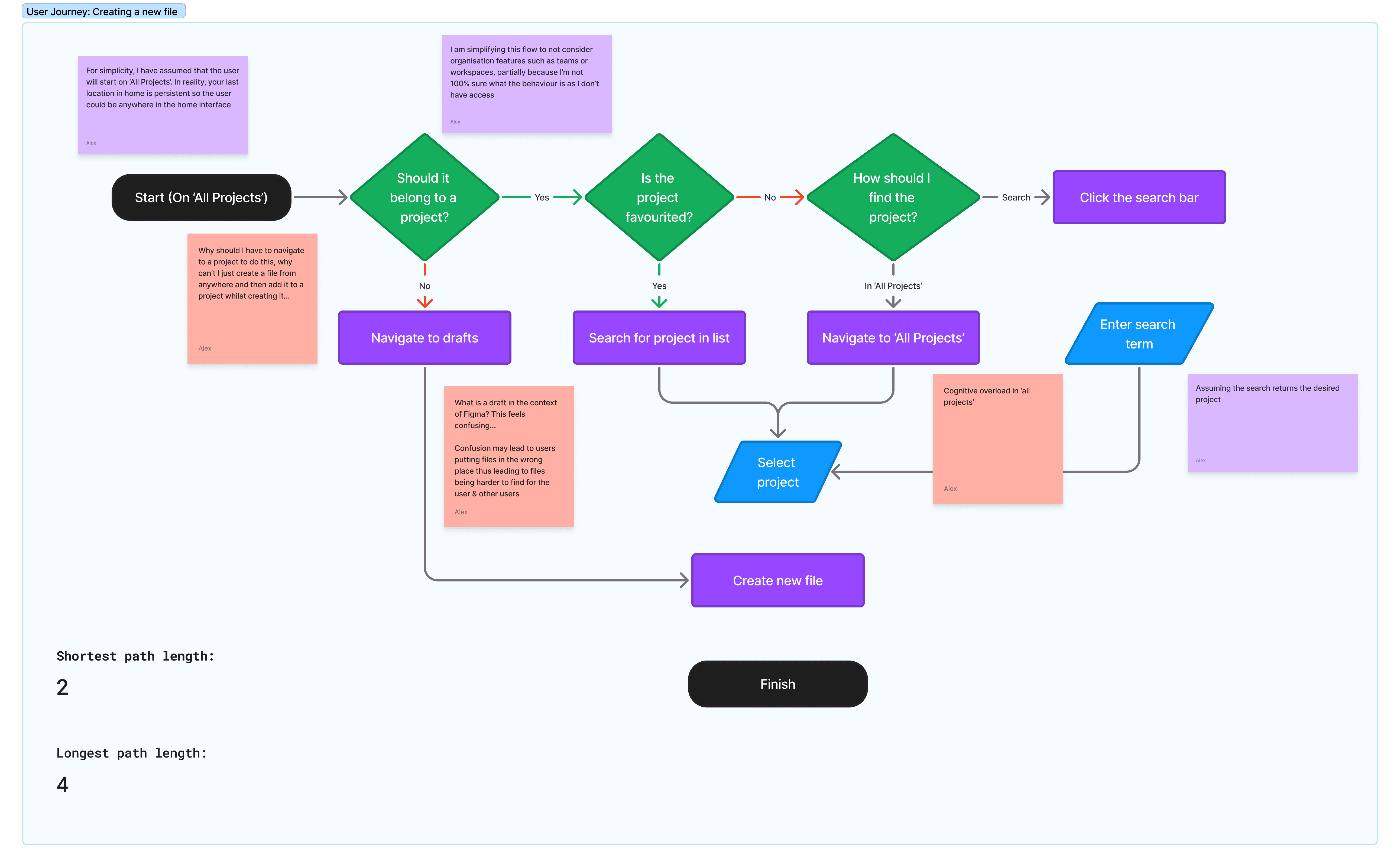
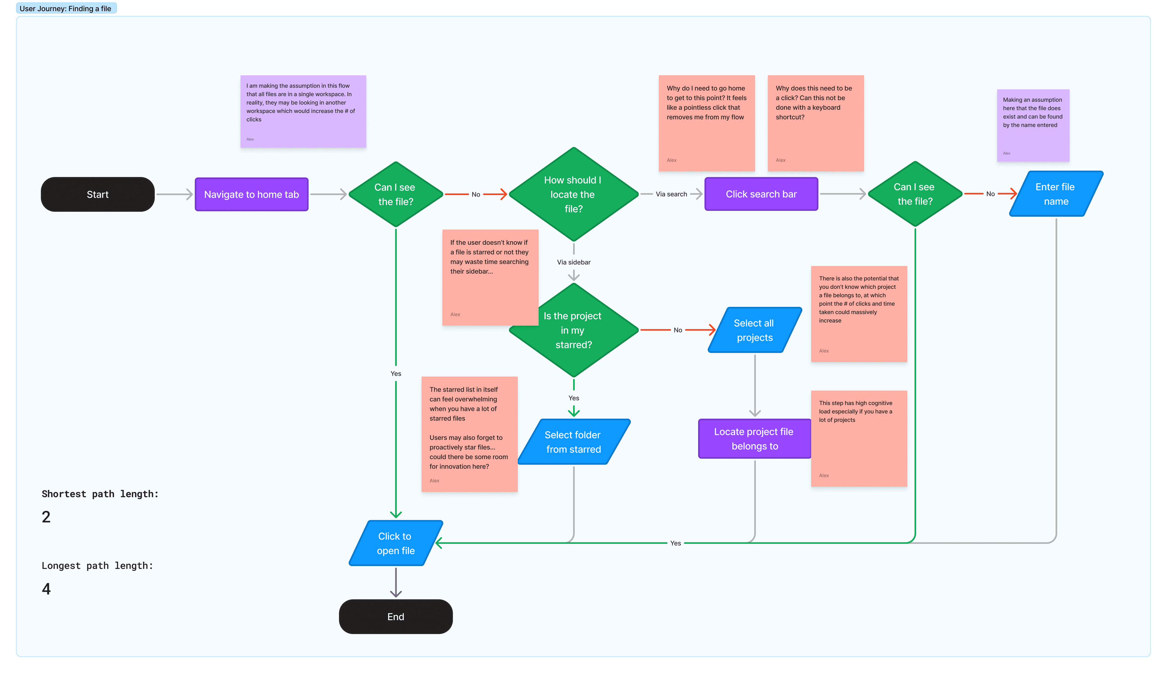
I mapped out user journeys for two key tasks. This helped me walk through the designer’s path, identifying key points of friction and measuring the shortest and longest paths to complete each action. While the mapping was relatively simple, real-world scenarios could be far more complex depending on the user’s starting point and other variables.
Creating a new file
Users face several frustrations when trying to create new files in Figma:
- Why do I need to be inside a project to create a file? Why not allow file creation from anywhere and let me specify its location afterward
- The ‘All Projects’ page feels overwhelming when faced with a large number of projects.
Finding a file
Users face several frustrations when trying to locate files in Figma:
- Users must navigate to the home screen to find a file, which feels unnecessary.
- The starred list in the sidebar becomes overwhelming because every new file is automatically favourited.
- There’s no keyboard shortcut to quickly launch search, unlike other products.
- Finding a file often turns into a guessing game, requiring users to click through projects to locate it.
Ideation
Prioritisation
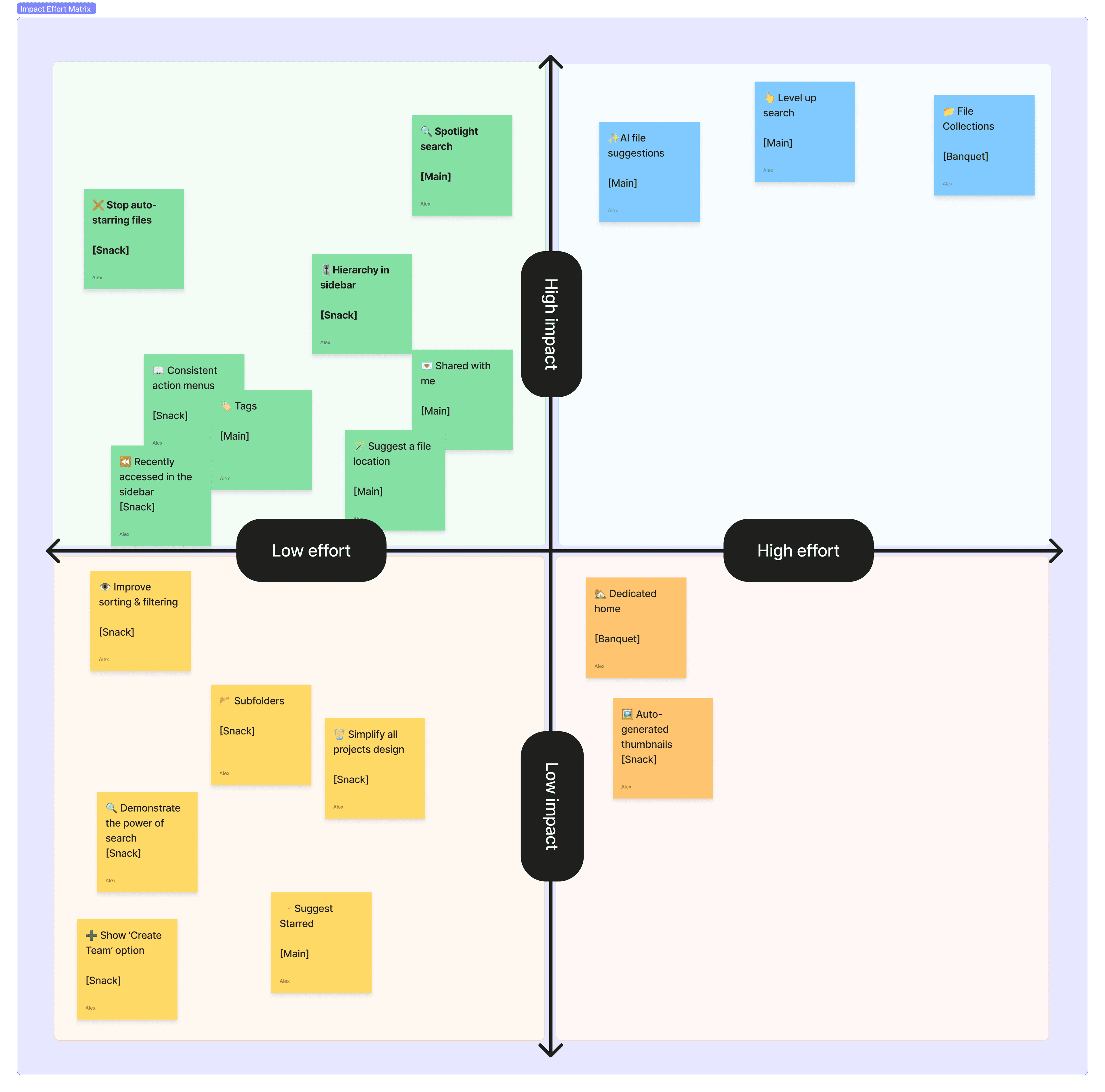
I prioritised ideas using a value versus effort matrix, breaking down ‘value’ into five categories; pain alleviation, frequency of use, workflow integration, differentiation, and efficiency gain, scored on a scale of 1-5.
I chose to move forward with three features: Spotlight, Hierarchy, and Stop Auto-Favouriting. These features represented high-value ideas that could be implemented within a single development cycle (4-6 weeks).
While top-right quadrant features hold significant potential, they involve greater risk and uncertainty, making them better suited for longer-term exploration after further discovery.
Design concepts
Spotlight Search
Overview
Designers spend most of their time in their files, and navigating back to the home tab disrupts their workflow. I wanted to create a solution that keeps designers focused and eliminates the need to leave their current file. This led me to challenge the assumption: why should designers have to navigate home to find a file?
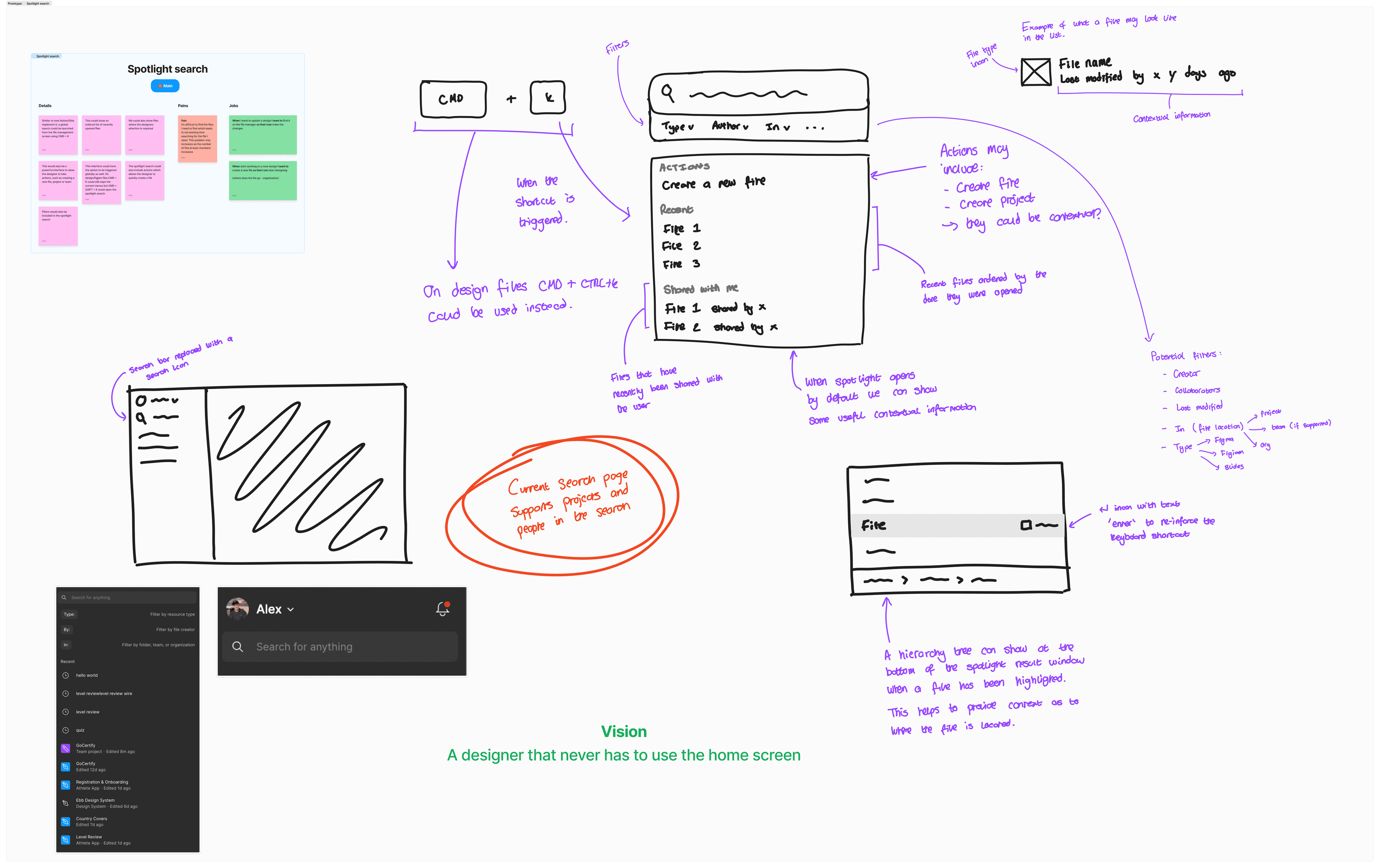
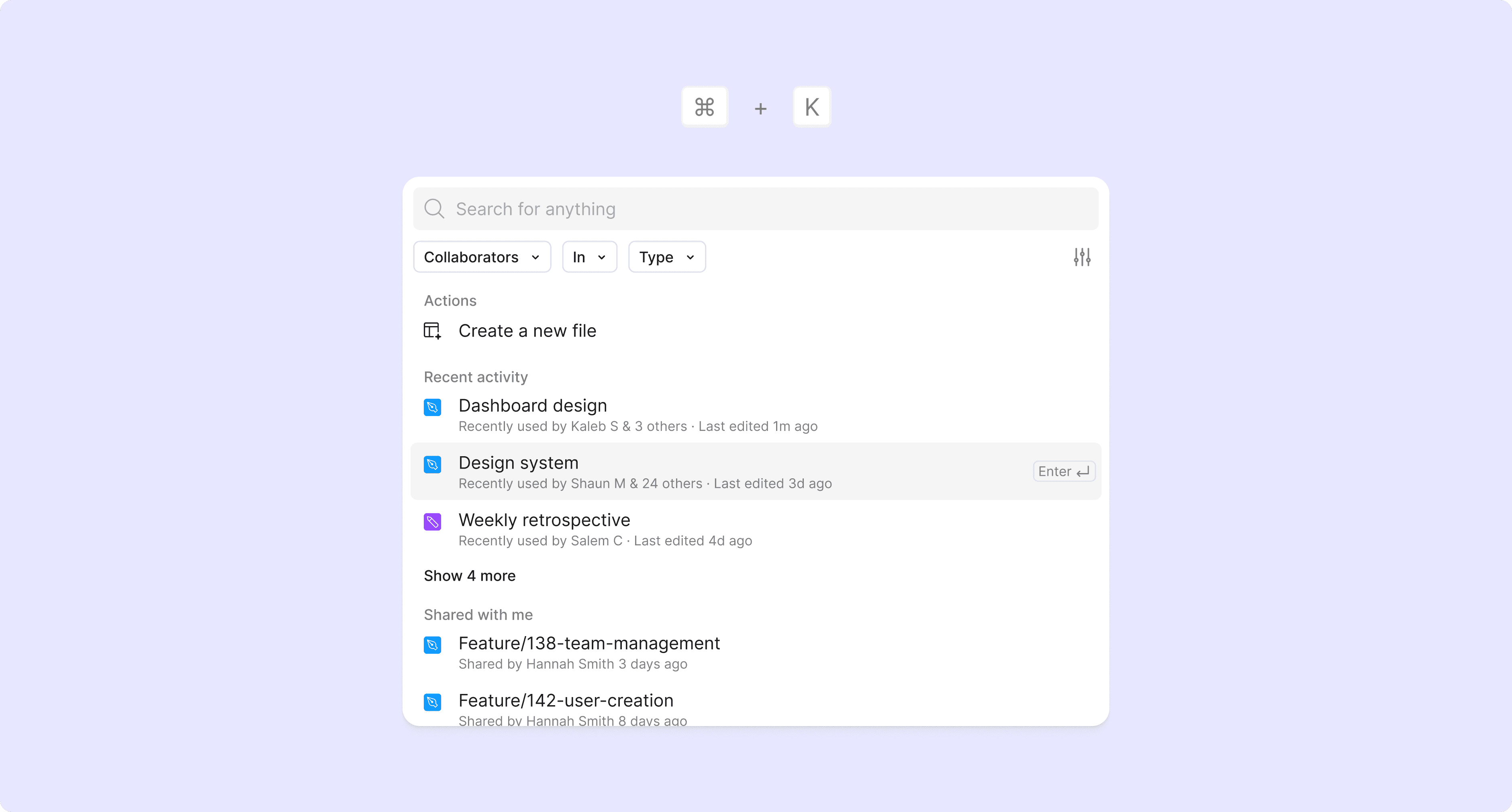
What is Spotlight Search? Spotlight is a globally accessible search window that works seamlessly across Figma, FigJam, and Slides. Designers can open it instantly with the CMD+K shortcut, reducing clicks and keeping them in their flow.
Wireframes
I began with fat marker sketches to explore the core concept, drawing inspiration from best-in-class tools like Notion, Linear, and Slite. The vision for Spotlight is simple: to ensure designers never need to leave their workflow to return to the home screen.
High fidelity
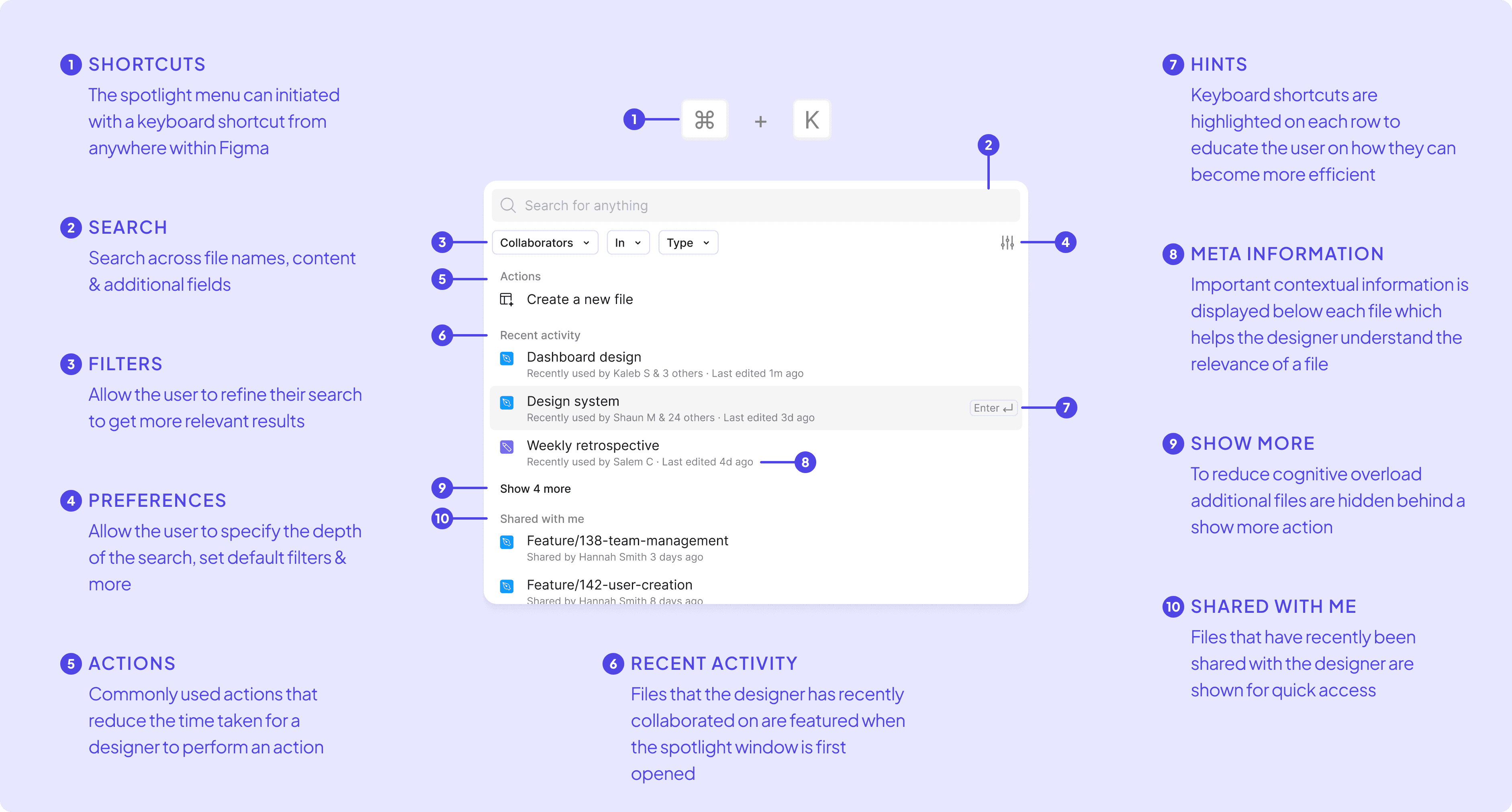
The design decisions for Spotlight Search focused on ensuring it felt like a natural extension of Figma’s updated UI. I aligned the visual styles with Figma’s design language and chose CMD + K as the shortcut to follow a familiar, recognisable workflow. To improve efficiency, I added actions at the top, enabling designers to quickly create new files without leaving their current workflow. I explored customisation options, allowing users to tailor their search preferences, such as depth (file name or contents) and default filters. Showing recent files was a priority, as these are often what designers need most. Finally, given Figma’s collaborative nature, I included a ‘Shared with me’ section for quick access to recently shared files.
Variants
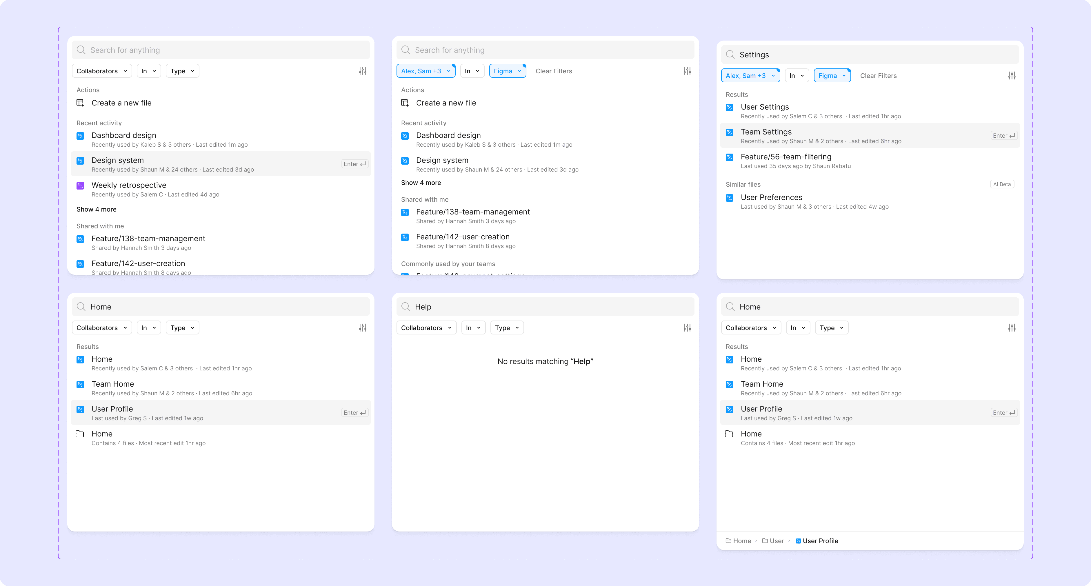
I designed additional variants to explore how the feature might look in different scenarios, building it as a fully functional component in Figma. Key ideas include support for filters and search terms, displaying folders in results, and showing where a file lives in the system using a breadcrumb tree.
Mockup
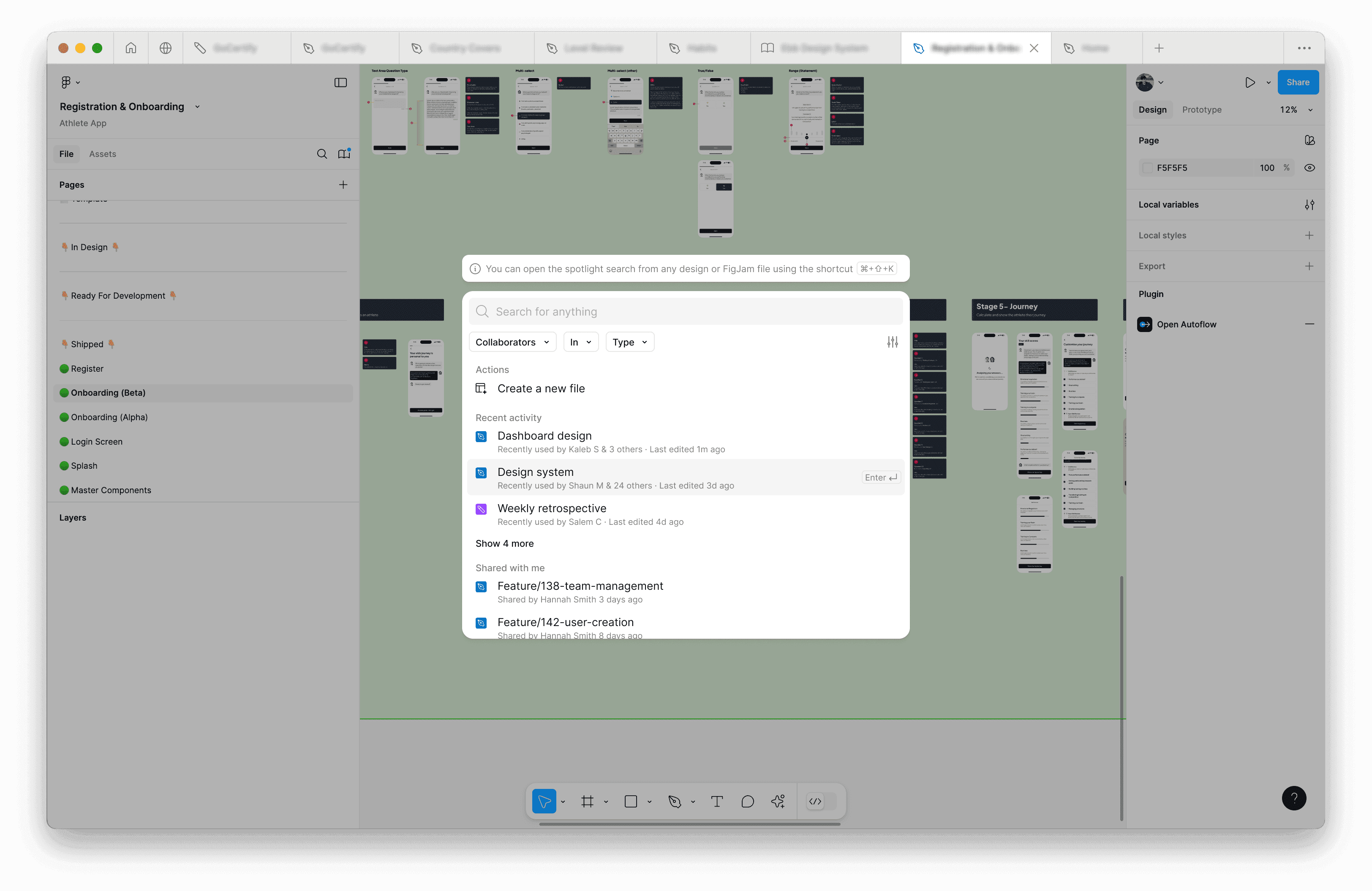
I mocked up how Spotlight would look within the product and explored ways to educate users on accessing it. A small tooltip above the modal could guide users, remaining visible until they open it once from a design file. I also considered adding a ‘Search’ tab in the top navigation bar to open Spotlight when clicked.
Future iteration
Think of Spotlight as the foundation for future innovation, a smarter, more efficient way to help designers get to what they need, faster.
In the future, Spotlight could:
- Recommend files based on your activity and preferences.
- Support natural language searches (e.g., “Show me the files Hannah and I worked on last week”).
- Expand its list of actions to supercharge your workflows.
Sidebar Hierarchy
Overview
The current sidebar has several shortcomings: the starred list becomes cluttered and unorganised, rarely used items like Trash and Admin are prioritised over files, and switching between teams adds unnecessary friction. Without a clear hierarchy, designers struggle to locate files intuitively, and organisations miss the opportunity to align the file system with their workflows.
What is Spotlight Search? This concept introduces a hierarchical sidebar where all files are accessible under their parent folders, with support for nested folders and projects. This structure allows organisations to better map files to their internal workflows, reducing confusion and improving efficiency.
Wireframes
I analysed the existing sidebar, annotating key areas to identify opportunities for improvement. From there, I sketched a concept that integrates a built-in hierarchy to enhance organisation and usability.
High fidelity
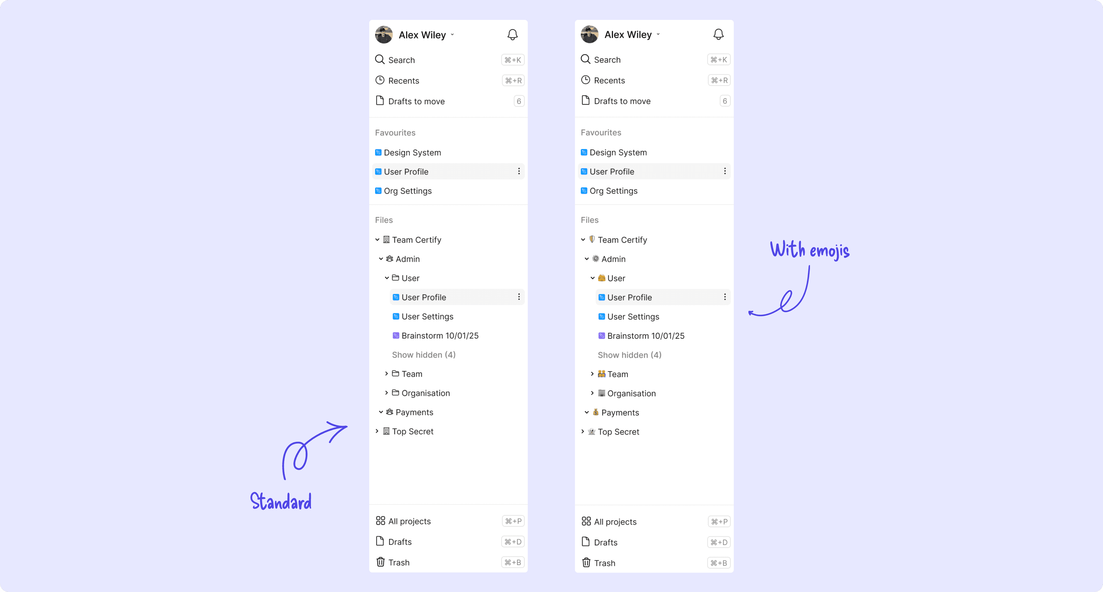
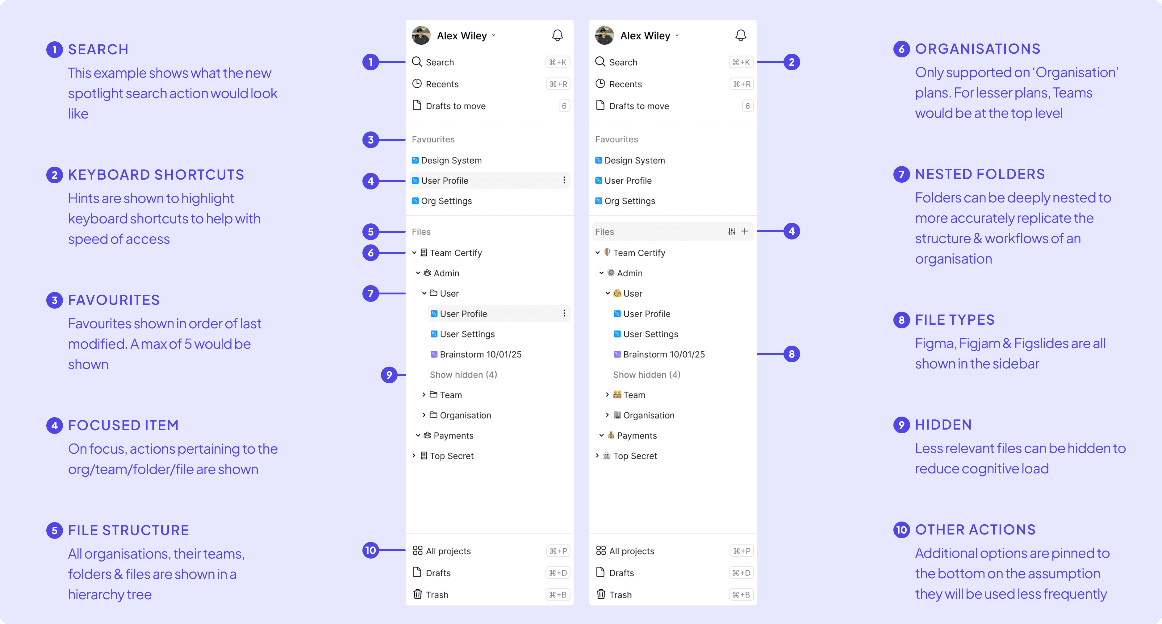
The redesigned sidebar was created to feel familiar to the existing one, reducing cognitive load and easing the transition for users. Icons are used to clearly differentiate between organisational levels (e.g., orgs, teams, folders), and all teams a user belongs to are displayed in a single tree structure. This eliminates the need to switch between teams, which I hypothesise will reduce the time it takes to locate files across teams. Users can also create orgs, teams, folders, and users directly from the sidebar, making it easier to organise and understand where files are placed. Less frequently used options, like Trash and Admin, have been moved to the bottom of the sidebar to prioritise key functions. To add flexibility and personality, customisable icons and emojis are supported, allowing teams to personalise the sidebar and make items quicker to recognise. Additionally, each page includes a tip for its associated keyboard shortcut, encouraging users to adopt faster navigation methods.
Variants
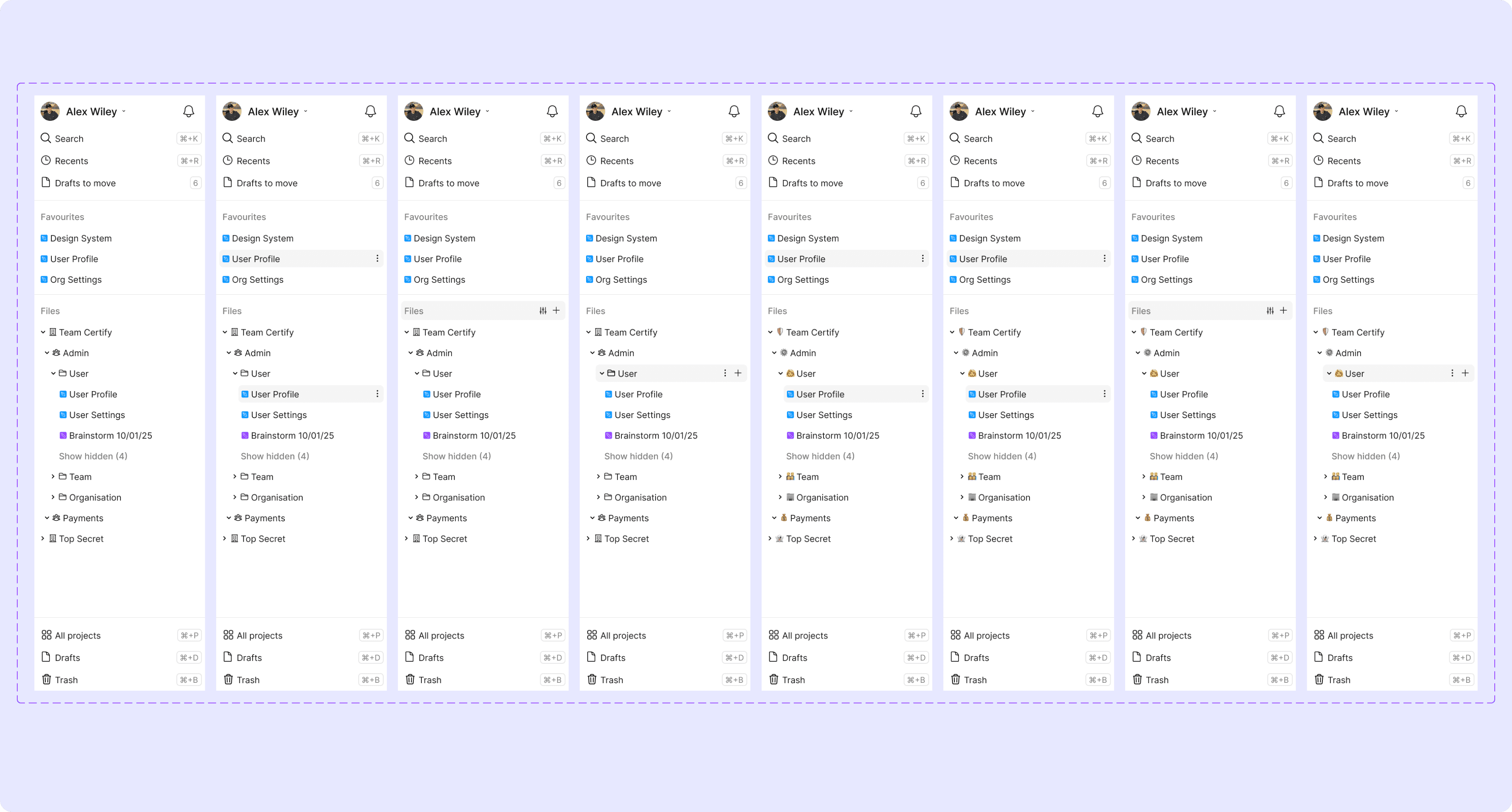
I designed additional variants to explore how the sidebar could behave in different states. A key addition I explored was support for emoji icons, allowing companies to add a touch of personality to their sidebar.
Mockup
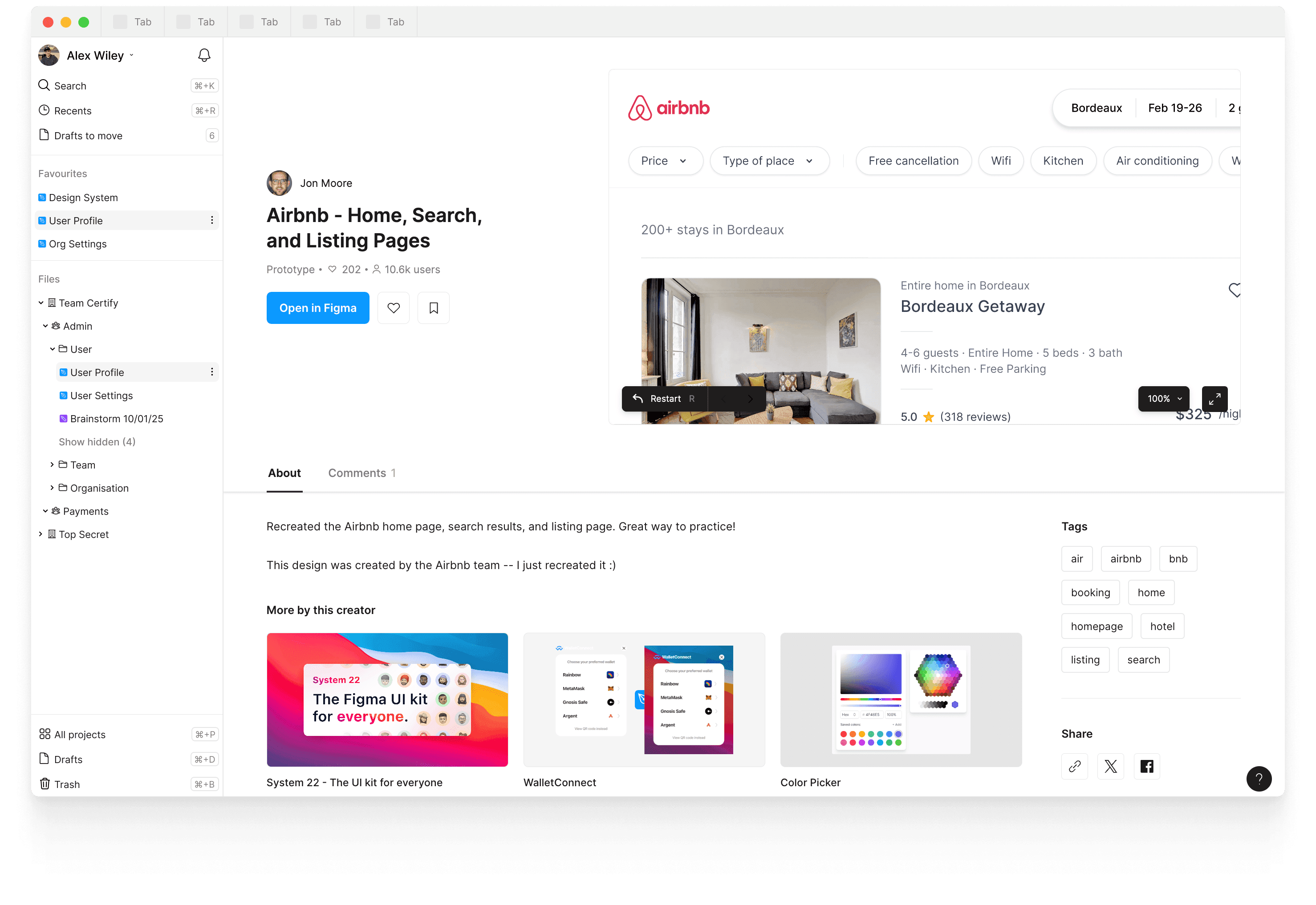
This mockup illustrates how the redesigned sidebar would look in situ within the app. One challenge I encountered was deciding what to display when a user clicks on a file. This sparked an exciting idea: leveraging the interface used for community files to show additional context about a file. By displaying key details upfront, designers could gather the context they need without opening the file, significantly reducing the time it takes to find the right file. This approach also lays the groundwork for powerful future features, such as adding tags to make files easier to find, including descriptions for added context, and linking related tools like Linear, Jira, or Monday. Additionally, summarising comments and displaying related files could provide even more value, transforming the sidebar into a central hub for design collaboration and file discovery.
Validating designs
Methods
To validate both designs I would use a Usability Test to gain early feedback in the design phase. Upon release, I would follow roll it out firstly using an A/B test to understand the impact of the feature.
Metrics
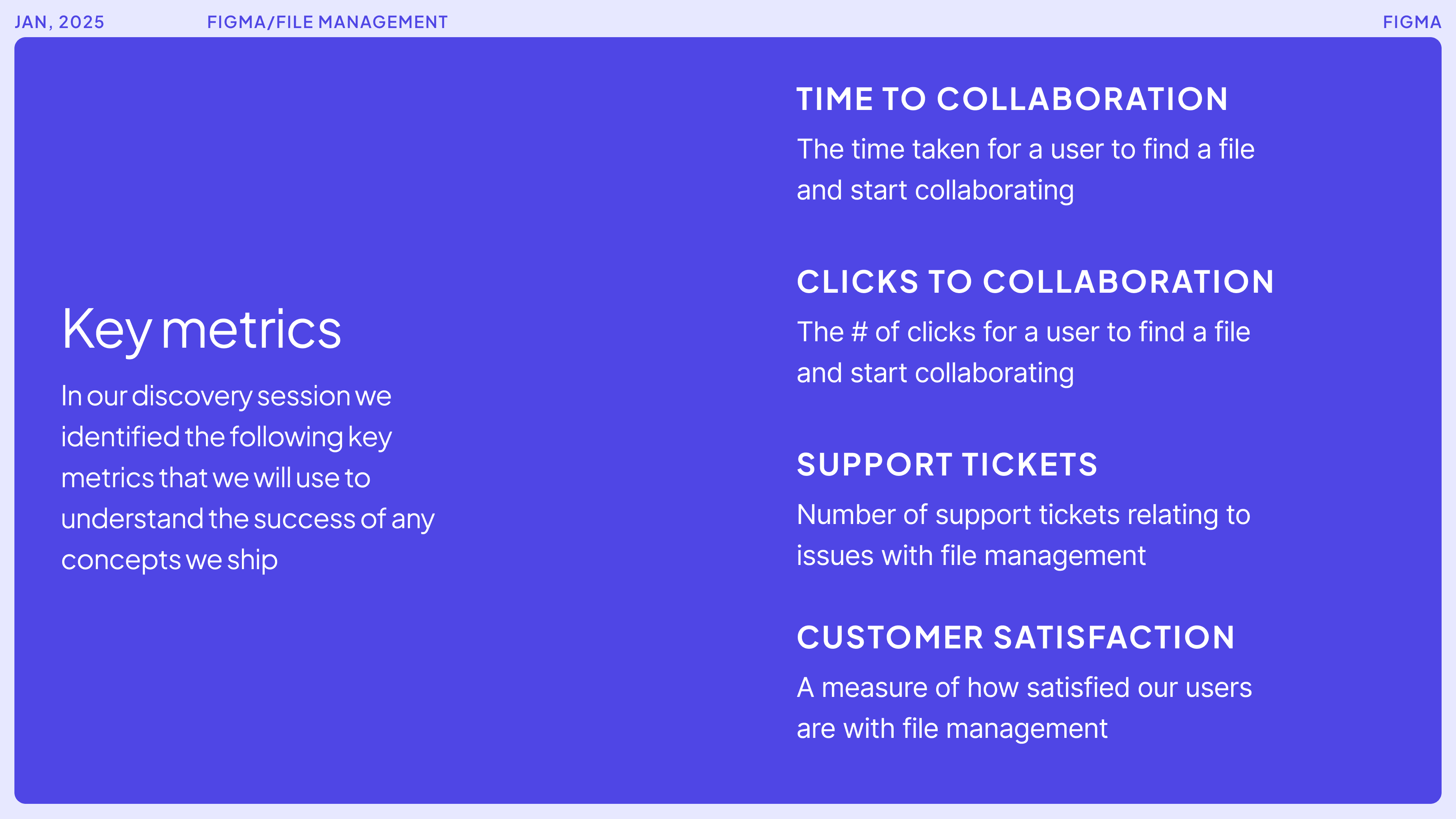
The primary metric we aim to improve with these features is time to collaboration, reducing the time it takes for a designer to start collaborating on a file.
Additional metrics to consider include:
- Search-to-file opened ratio
- Files opened from Spotlight
- Files opened from the Sidebar
- CSAT (Customer Satisfaction Score)
- Adoption percentage
Summary
What more could I do?
Given the time constraints of this task, I relied on my own experiences and insights from a few designer friends. In a real-world setting, I would have conducted additional usability tests to better understand how designers find and create files, as well as gained deeper context about Figma’s specific challenges and user needs.
Want more detail?
Let's chat
I’ve intentionally kept my online portfolio light on detail to let the visuals speak for themselves. However, I’d be happy to dive deeper and discuss any aspect of my work.
Book a chat with me →